CASE STUDY - NONPROFIT
Love Without Borders

Love Without Borders for Refugees in Need is a nonprofit organization that seeks to help support refugees in Greece regain stability and autonomy over their lives. Using art as a means for self-expression and a tool for economic independence.
User Research, UI/UX Design
Love Without Borders has a low user engagement online. A major part of this is because there is too much content. The nonprofit also has poor branding which makes it hard to attract more users to go on the website.
I was hired on by my friend and worked directly with her and the CEO of the non profit. The biggest constraint with this project was that no one in the organization had design experience and everyone put so much work into every aspect of the non-profit. Everything I designed I had to make sure that it gave respect to those who have worked on it before, while still being a good design.
To understand users' motivations on why they volunteer and donate, I conducted a survey and several interviews. From there I took the responses and did various exercises to find common themes amongst the respondents. Here are a few things I learned from my research:

USERS NEED TO SEE IMPACT

USERS ARE MISSION DRIVEN

AWARENESS OF THE ORGANIZATION
01.
Showcase artists' stories and work with numbers and statistics.
02.
Emphasize goals and what the nonprofit is trying to accomplish.
03.
Focus on content strategy and help create a brand.
Love Without Borders is still a fairly new non-profit that is building momentum. In order to gain more support, I did an extensive amount of research and studies in order to help them target a certain demographic. What I found was that 20 to 48 year olds who have traveled abroad were the ideal market to target.

Becca studied abroad for a semester and learned about the refugee crisis. After that she became an activist and learned about Love Without Borders.
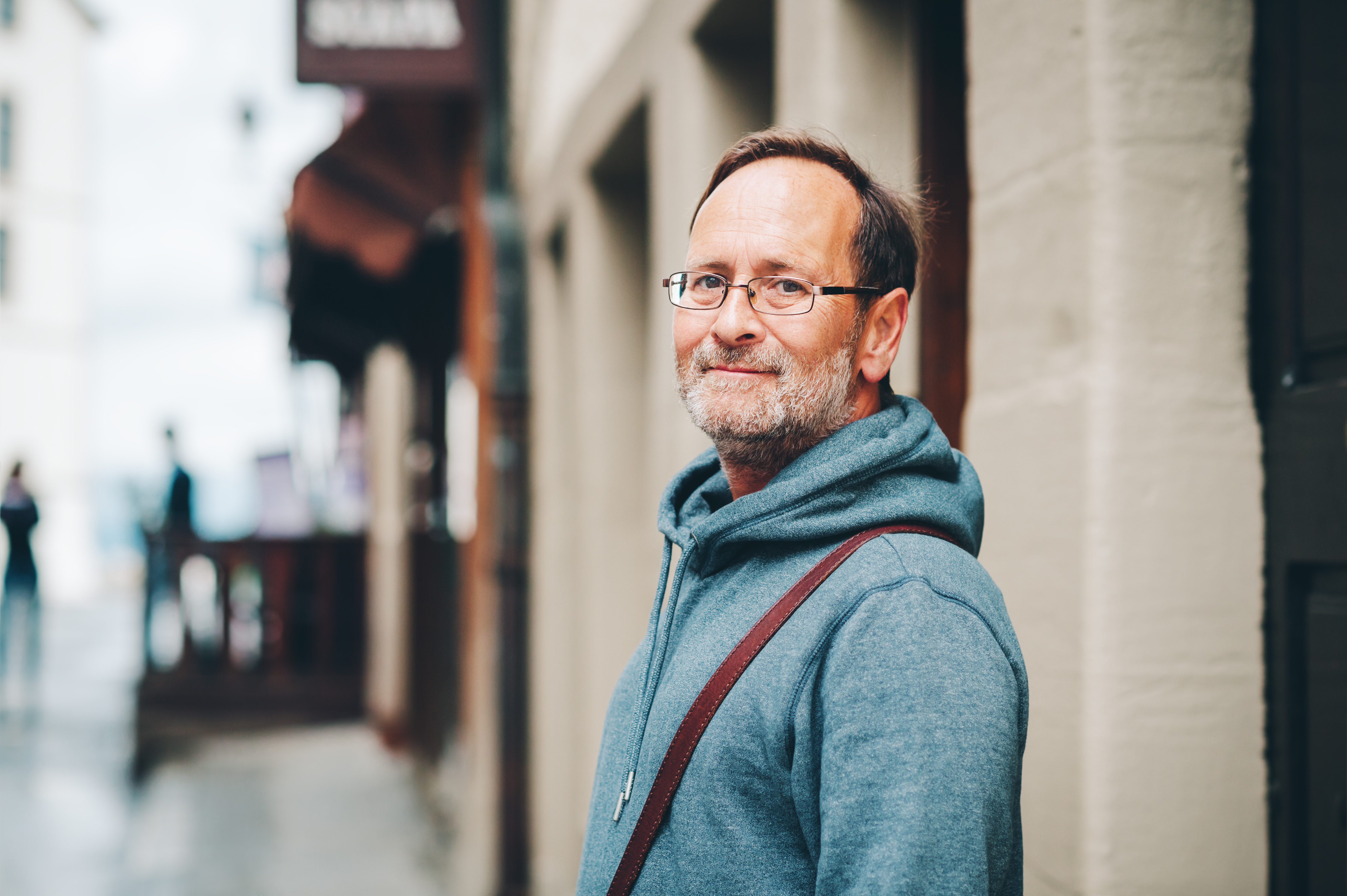
Mark is a writer and was covering a news story about the Syrian Refugee Crisis and now is commited to the cause.
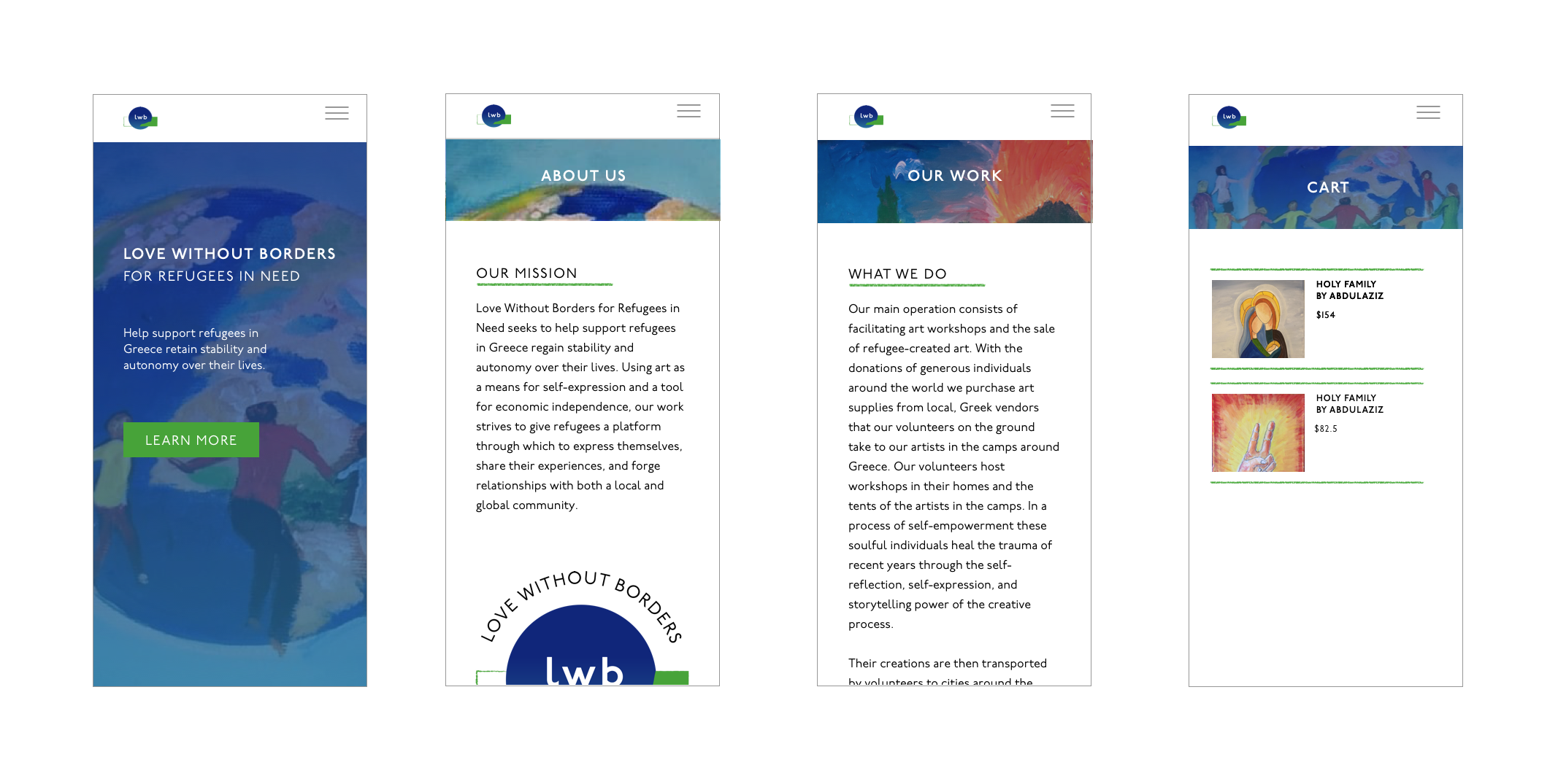
One of the largest challenges to this website was that there was too much information and too many links to click on. My main goal here was to simplify this layout and edit down the information so that it can lead users to buy art and the information architecture helped me do that.
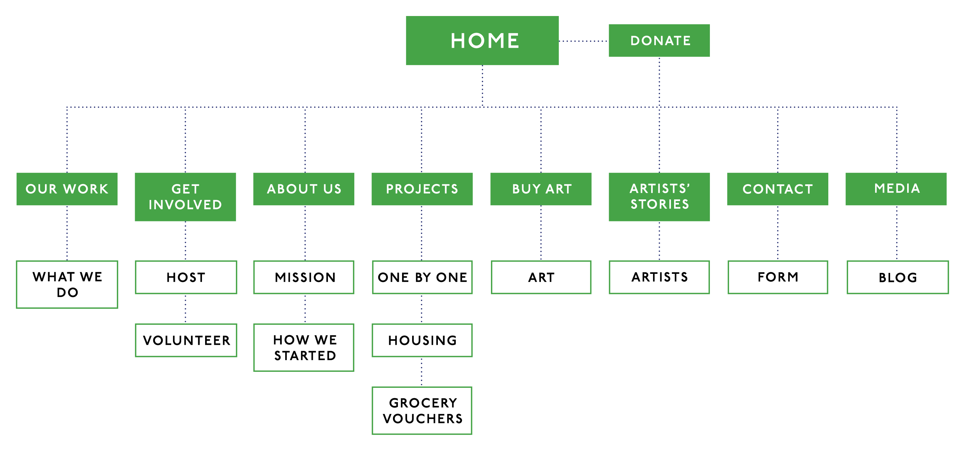
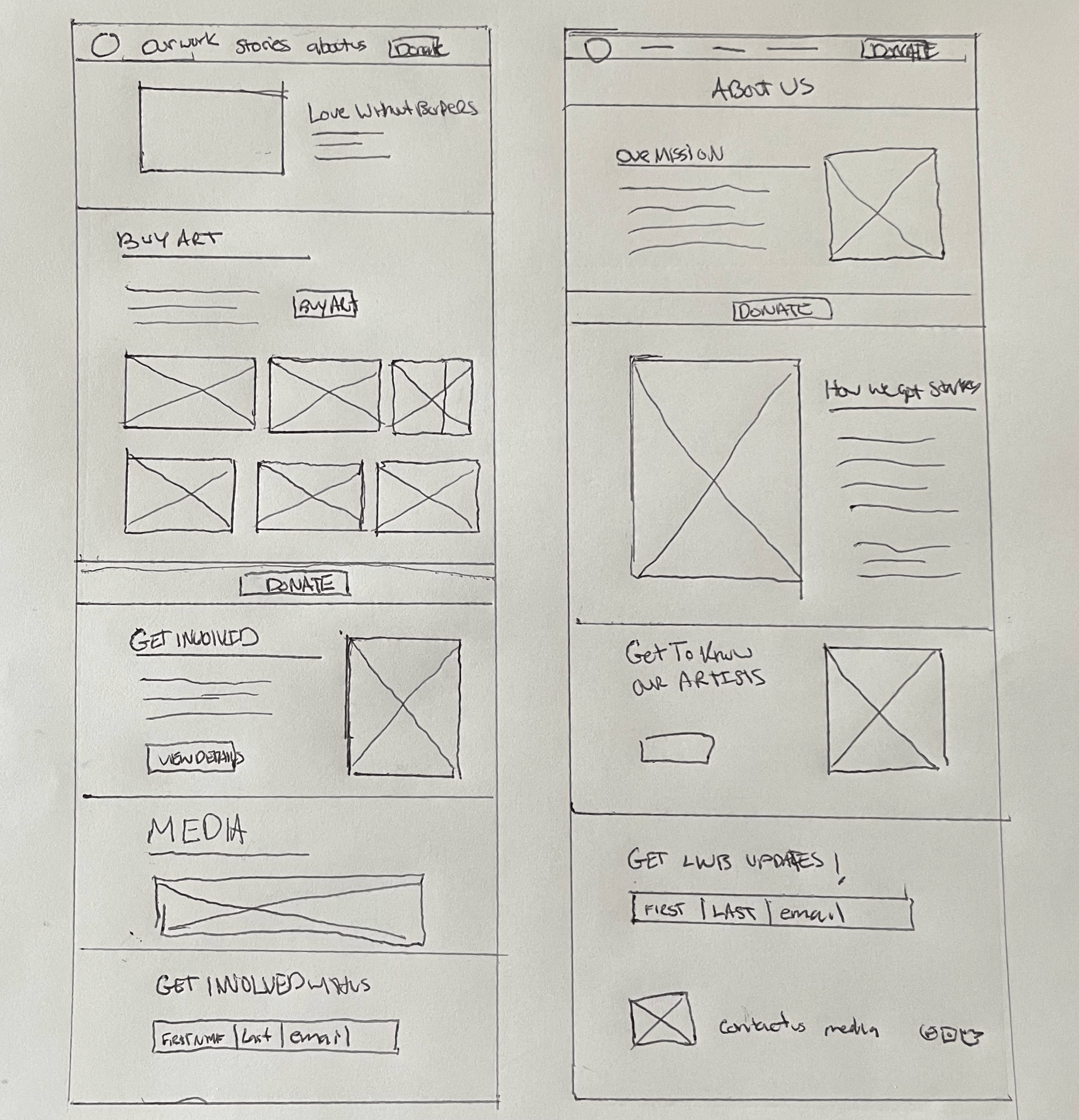
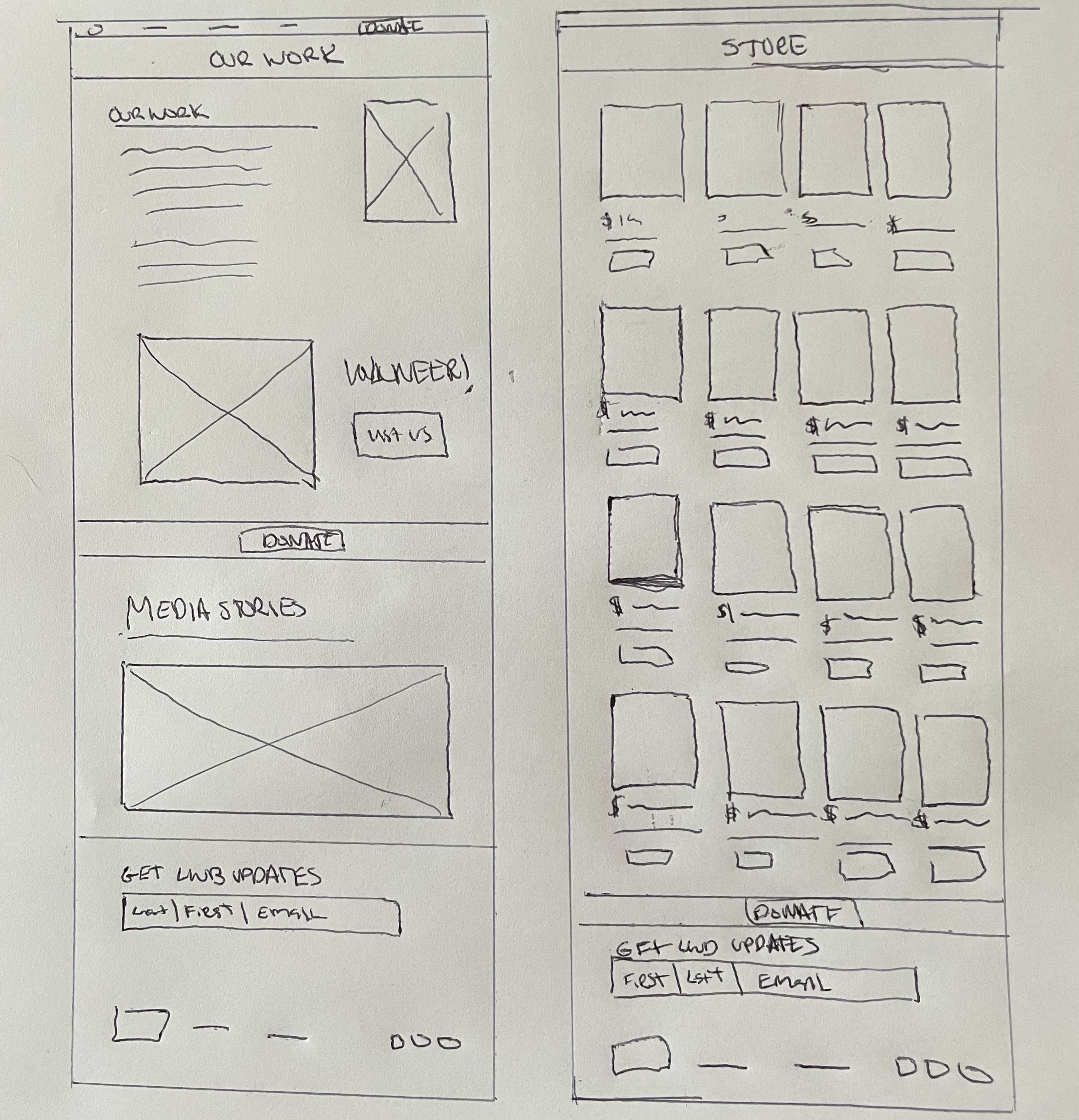
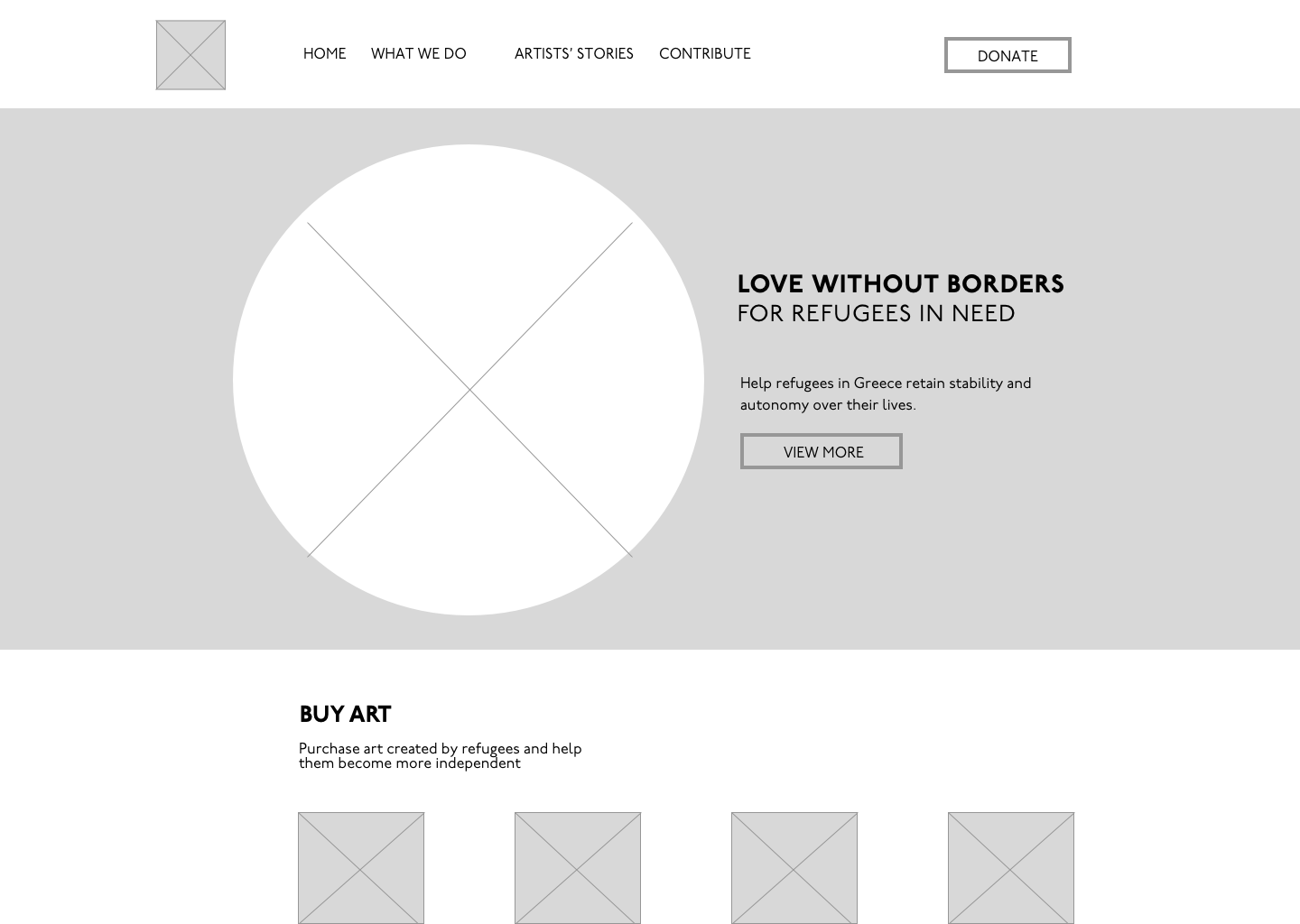
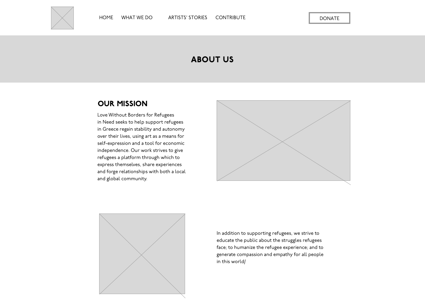
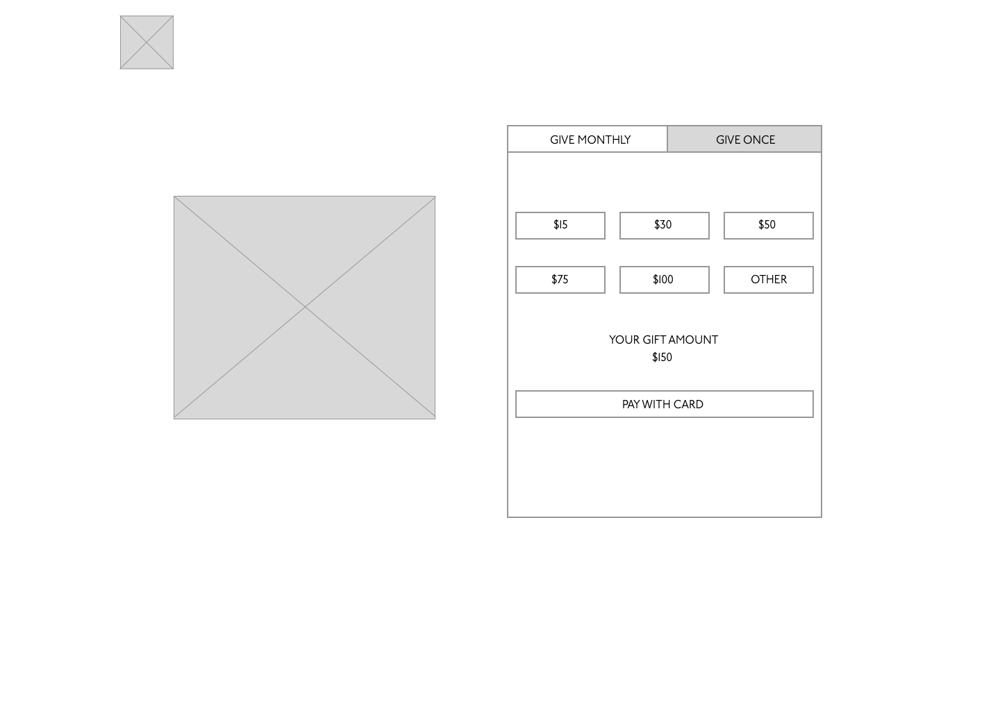
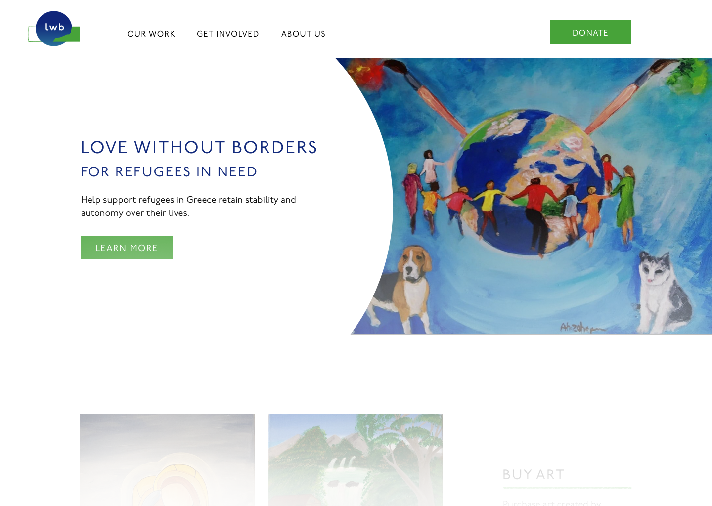
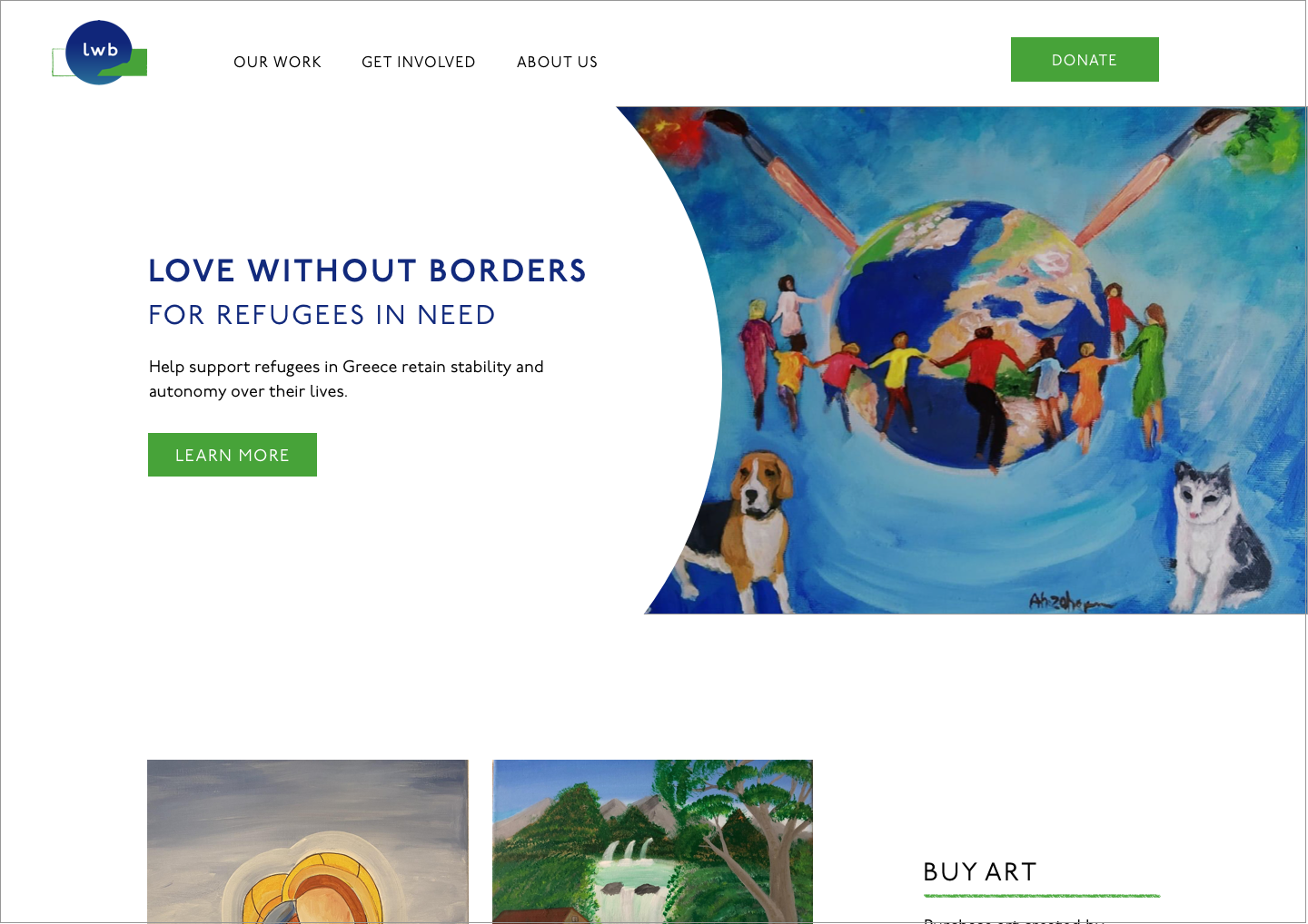
While doing user testing I got some feedback saying that the main page needed to have imediate impact and show what kind of organization it is. To fix this I used a painting that symbolized the organization.

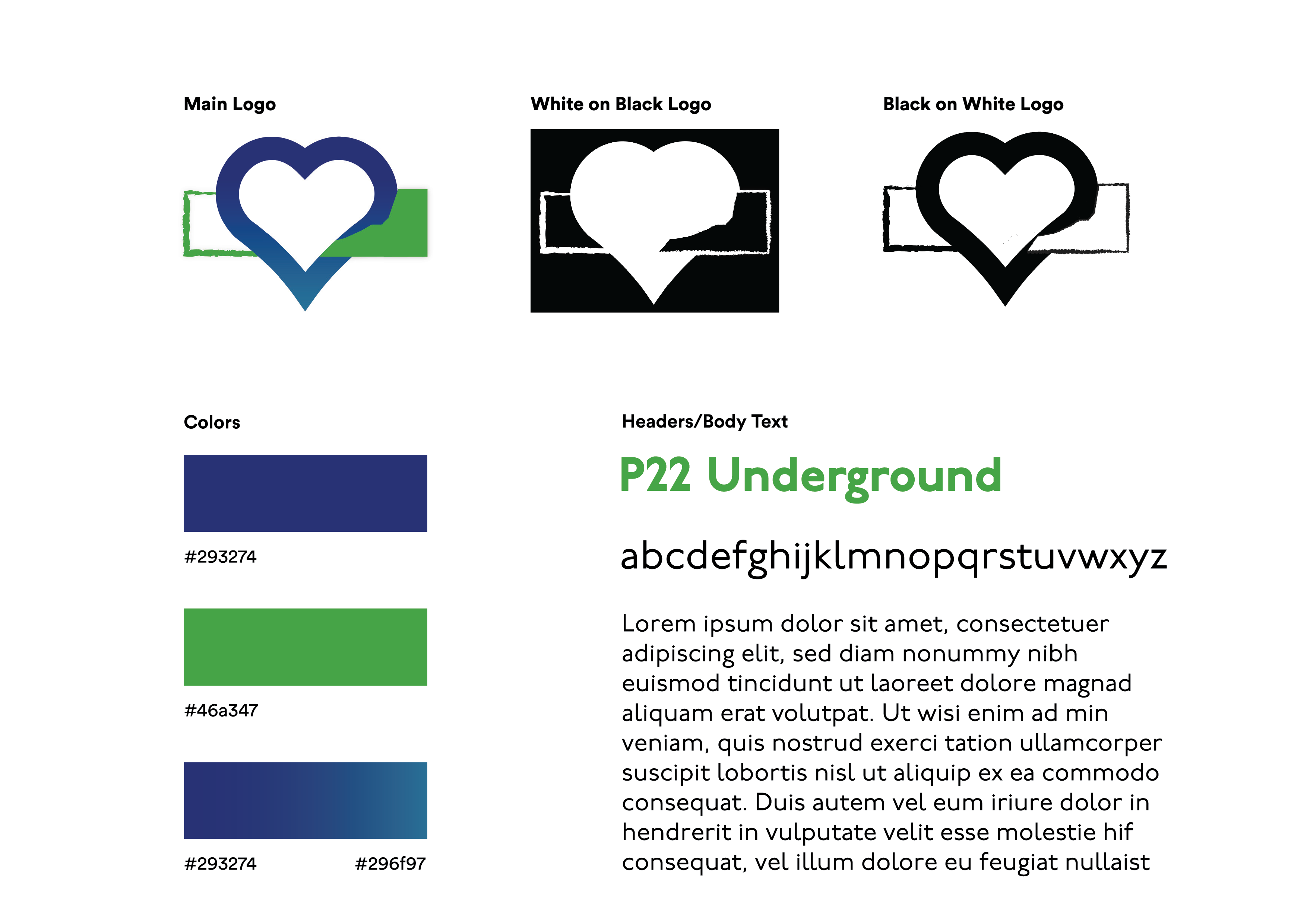
One of the biggest hurdles I had to jump over was convincing the CEO that they needed a legitimate logo. The one they had previously was a painting that did not have the non profit’s name on it. They also were using different icons or painting for different platforms. Creating them a logo was a large step in cementing their non profit as a trustworthy organization.
I made sure the main page would highlight the rest of the website while still always going back to the art which is what supports the entire organization.
The about us page is important to get the copy right because it highlights the mission of the nonpofit and gives crucial information that could lead users to donate.
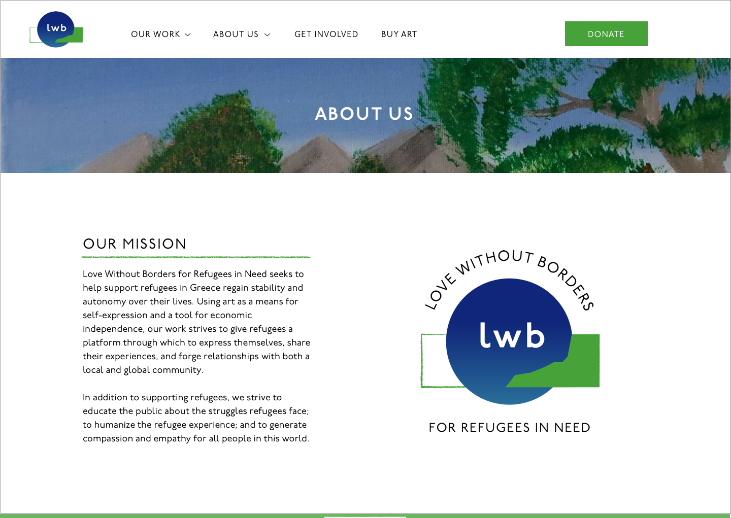
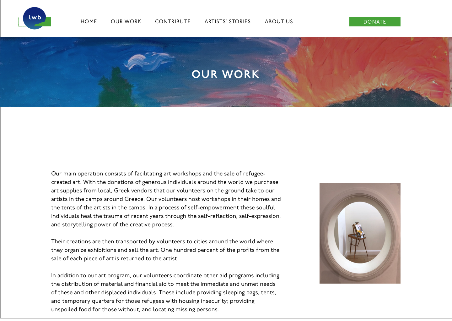
To not overwhelm the users with too much information I separated this from the about us page. This allowed for more explanation of the work the organization does and how many people it affects.
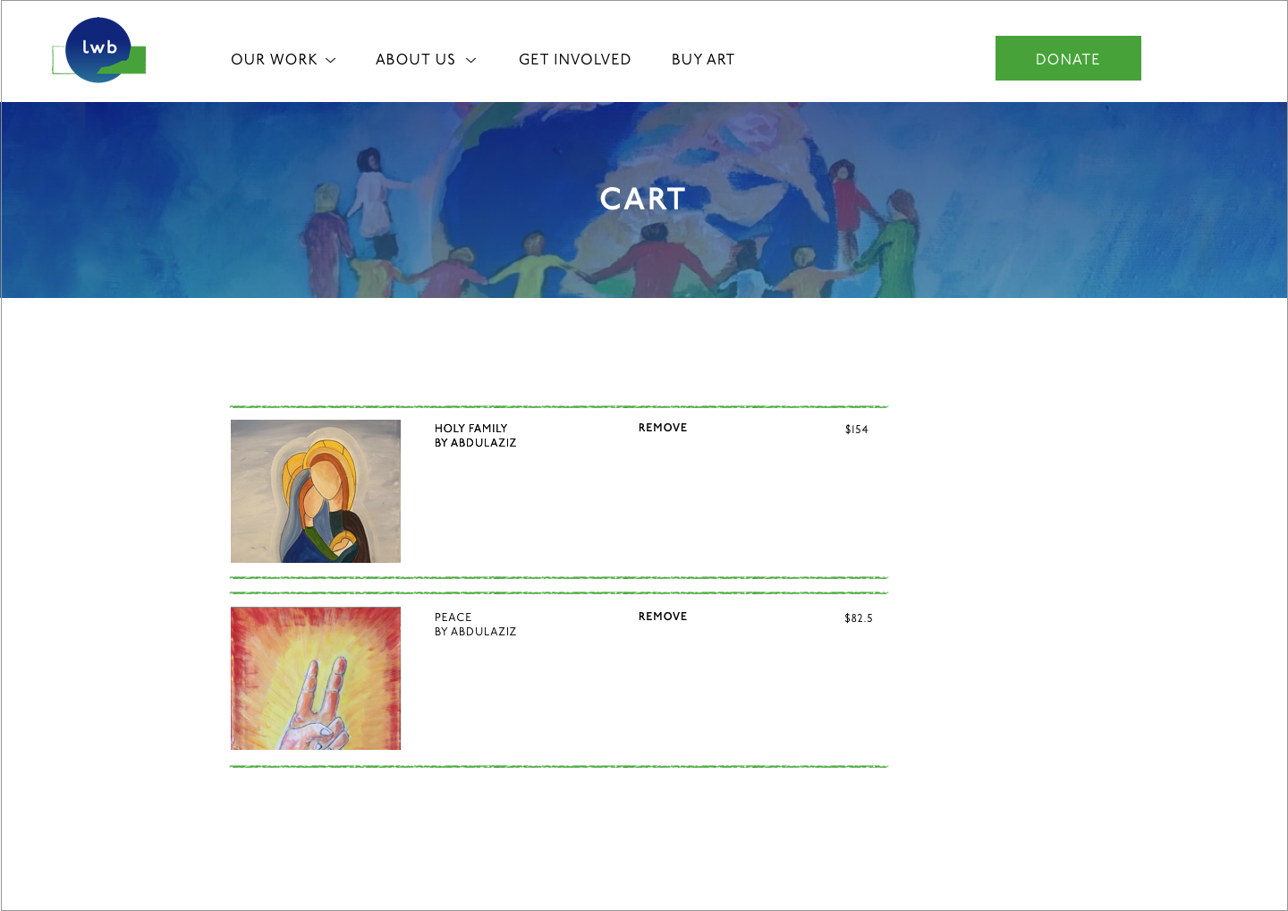
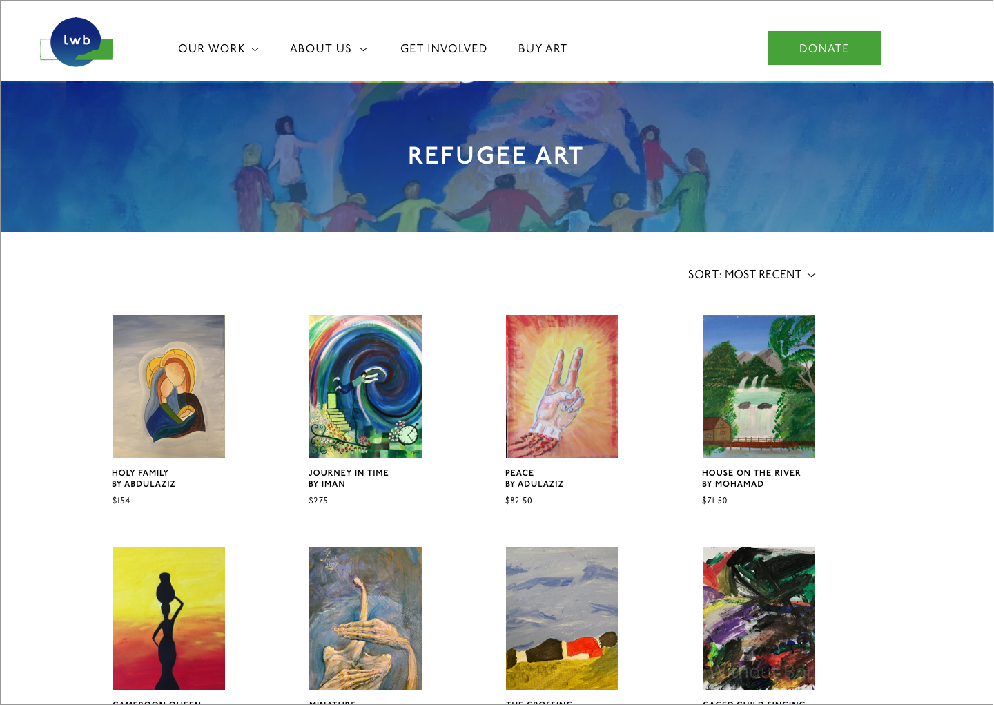
The main goal of the project was to lead more users to buy art online. To do so I integrated the online store with the website while keeping it on brand.
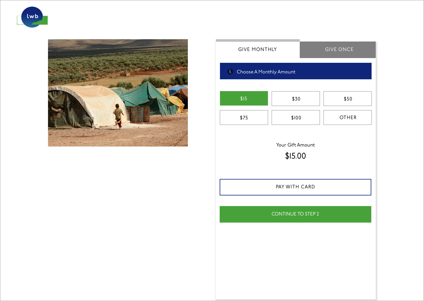
I was influenced by several nonprofit websites and wanted to make sure this process was as easy as possible.
I struggled whether I should put two purchased items in the same row but decided against it. Being able to have space in order to clearly understand the information was the priority.
